My Role
I entered the project after a first iteration was created. I collaborated with the existing designer at the company to achieve the following:
Create user personas, user flows, wireframes, and prototypes.
Redesign and created user interfaces based on previous research.
Collaborated with development teams to ensure feasible design implementation.
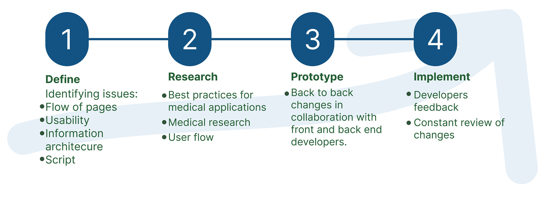
Results
The redesign process spanned approximately four months, involving extensive collaboration and iterative work closely intertwined with the developers' team. Some results were:
Improved usability and aesthetics.
Implemented best practices of accessibility.
Refined information architecture for easier navigation.

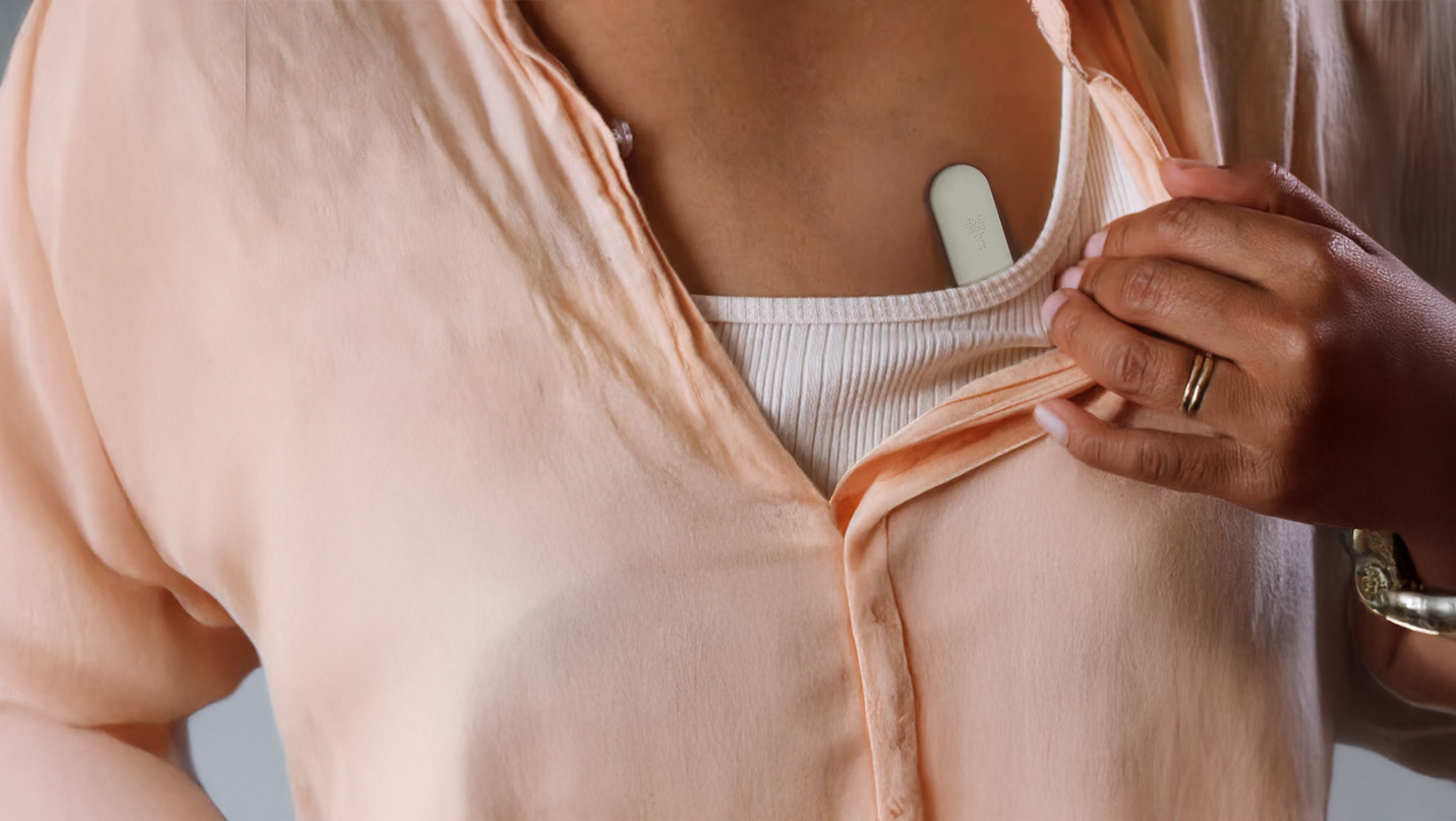
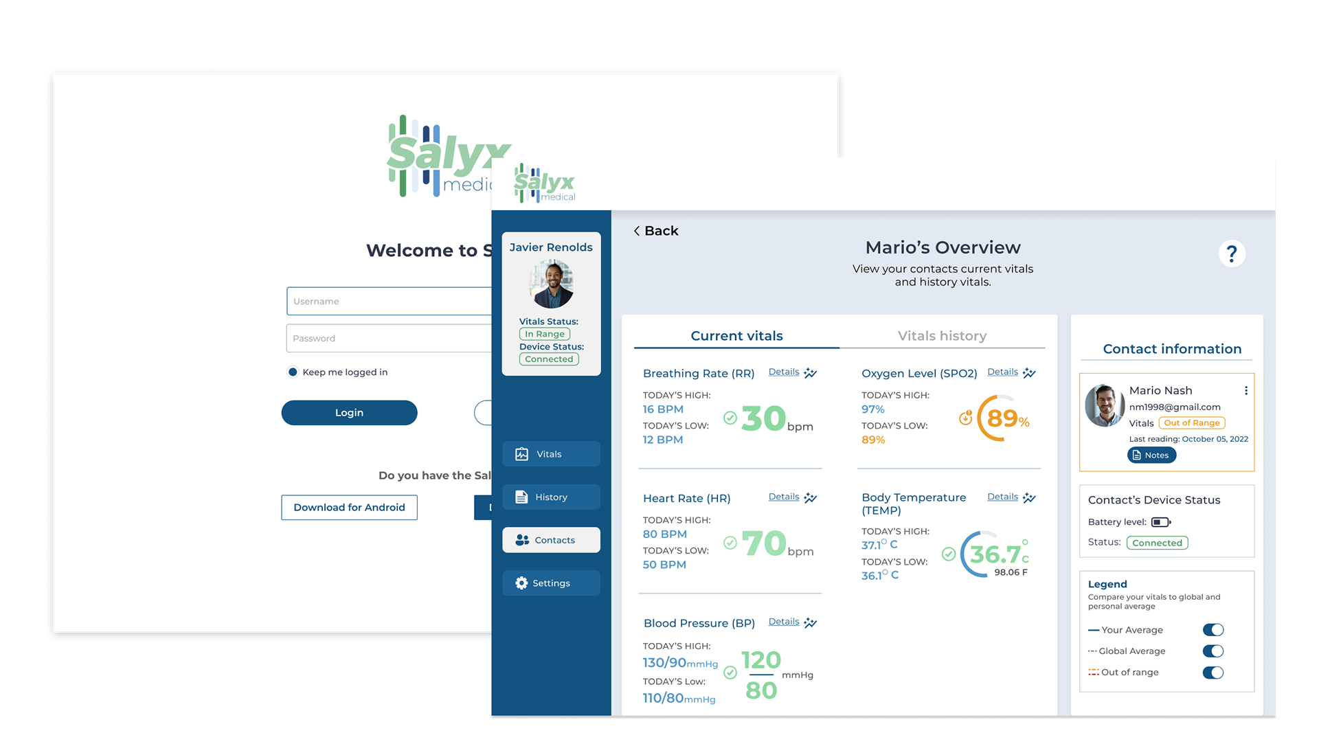
Vital Information at Your Fingertips
Salyx is a medical technology company that provides innovative wearable devices to empower individuals to take charge of their health. Their wearable device tracks five vital signs, including heart rate, blood pressure, respiratory rate, body temperature, and oxygen saturation levels.
Medical resources can be scarce, resulting in limited availability of healthcare services and resources.
Salyx offers a groundbreaking medical device that serves as a gateway to valuable health insights. This innovative device seamlessly tracks and monitors essential vital signs, enabling users to easily access and understand their health data. By bridging the gap between individuals and medical resources, Salyx Medical empowers users to take charge of their well-being and make informed decisions about their health.
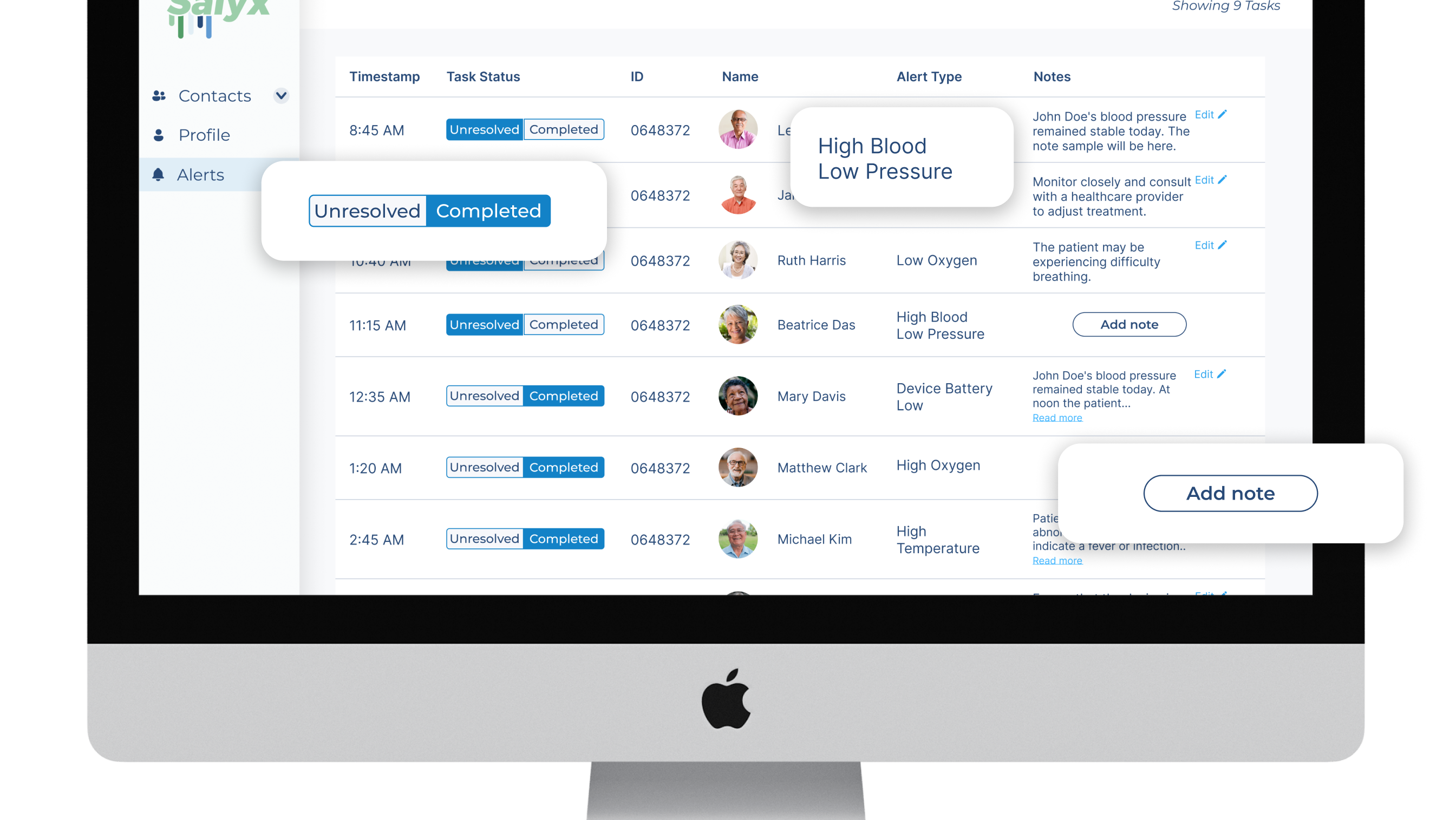
The initial version of the app was exclusively tailored for medical professionals, drawing upon extensive interviews with healthcare experts to determine the optimal presentation of patient medical information for quick comprehension.
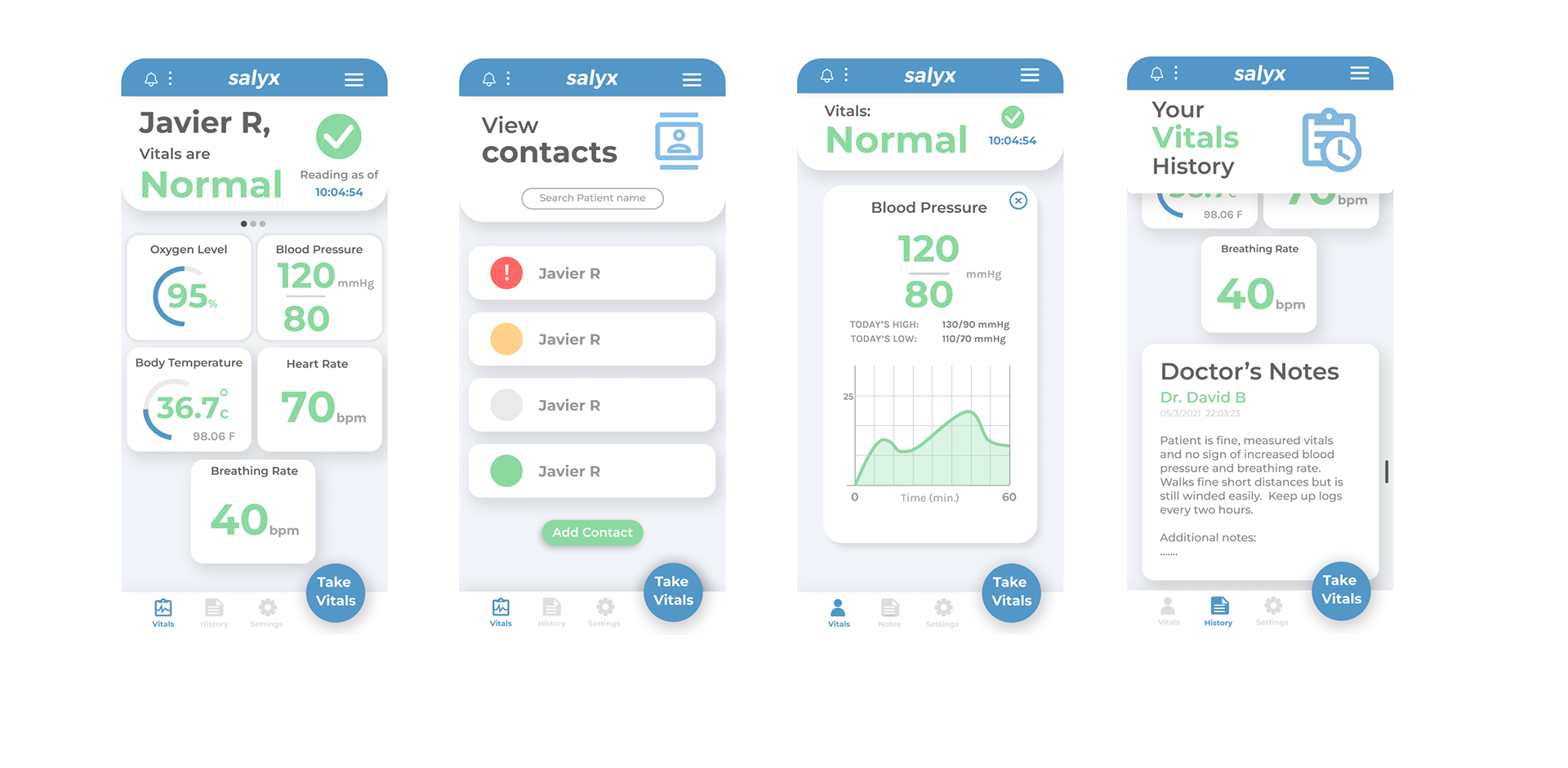
Our new version retains the core features derived from that research, while also emphasizing the integration of an app that caters to the needs of both medical professionals and individuals interested in monitoring the vital values of their family members or themselves.
Bridging the gap between Medical Professionals and individuals

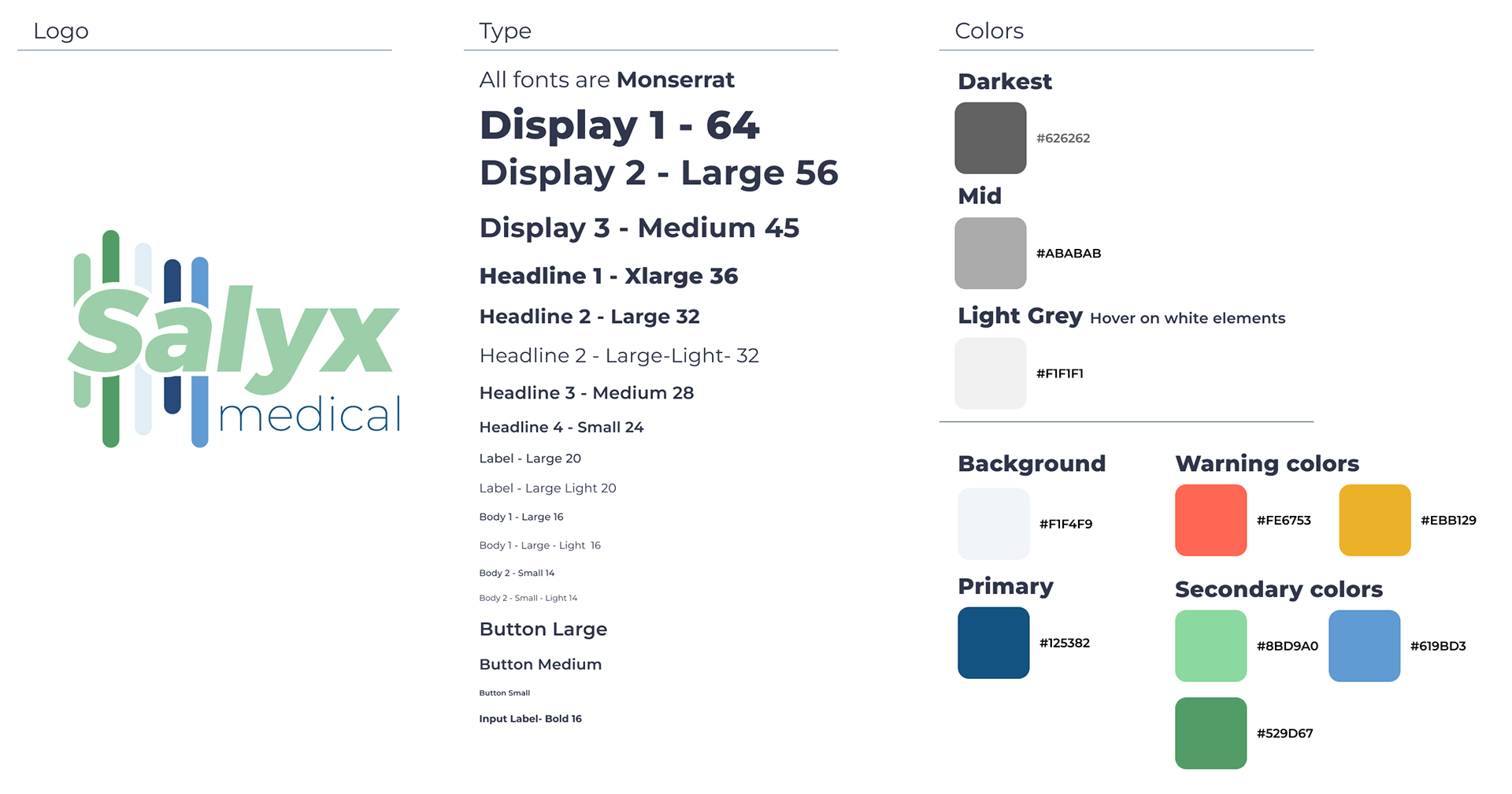
We began by redesigning the company logo and creating a style guide for the mobile application. This process aimed to enhance the visual identity and ensure a cohesive and consistent aesthetic throughout the app.
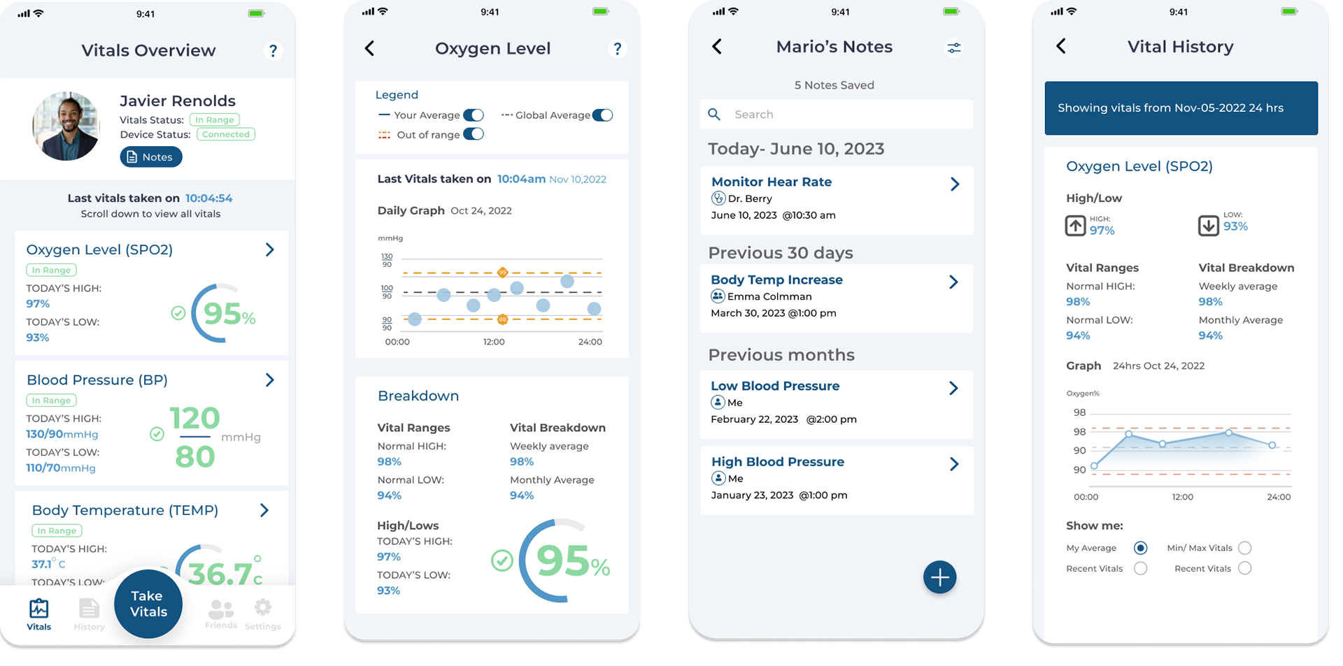
Key changes
Good color contrast enhances app accessibility for users with low vision or color deficiencies, improving usability and user-friendliness.
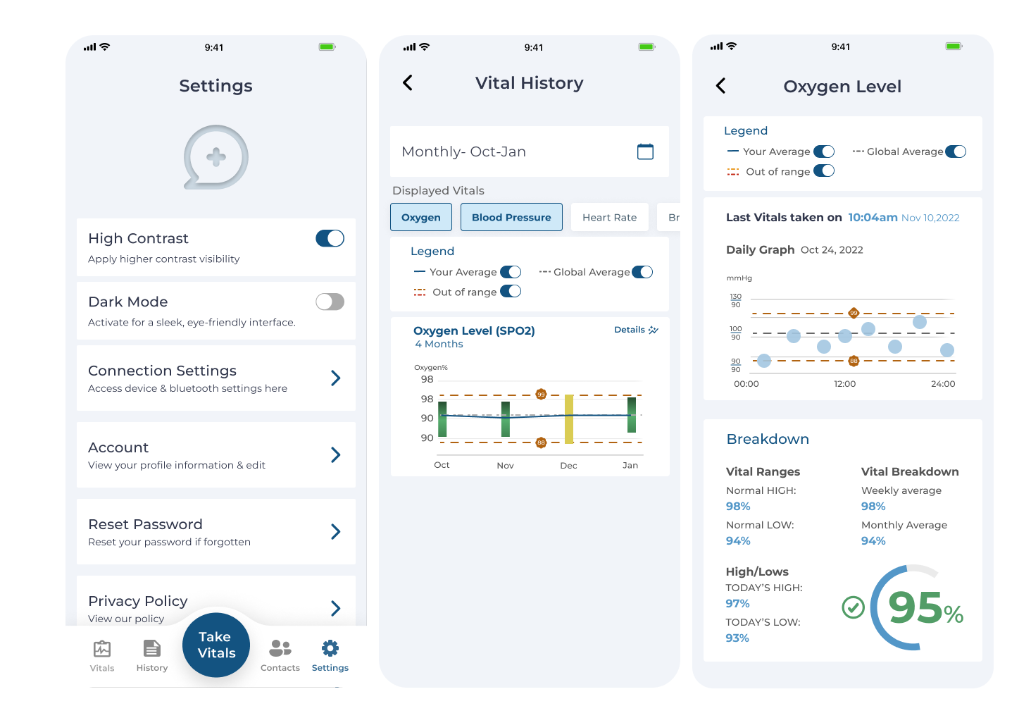
To ensure that the app design was inclusive, I used the WCAG contrast checker plugin on Figma, which allowed me to verify that each screen passed at least the AA level color contrast. By doing this, I was able to identify any potential issues with color contrast and make the necessary adjustments to ensure that the app is easy to use for all users.
We were also cautious that the font size though out the mobile application was not a minimum of 14px.

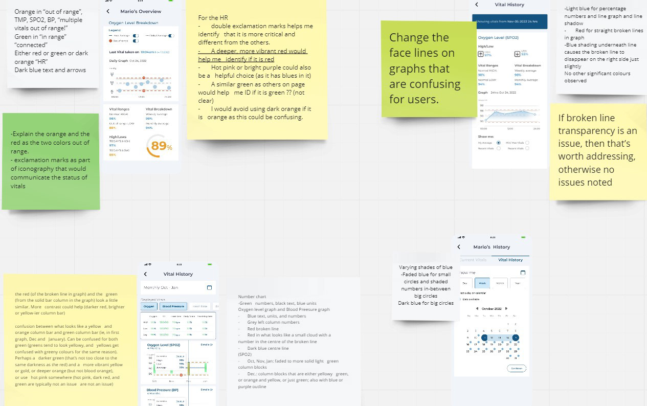
In line with WCAG guidelines, we conducted user research with color-blind individuals to enhance color contrast in the Salyx app.
By showing them a small set of samples from the app and providing explanations, we aimed to assess the effectiveness of the contrast, particularly in graphs displaying data. The research also uncovered other elements that required attention, ensuring a more seamless user experience and addressing any potential confusion or misguidance. Their valuable feedback informed targeted improvements, ensuring inclusivity and usability for all users.
In order to enhance accessibility while preserving the original color palette of the Salyx app, we introduced a new feature. Users now have the ability to toggle on a full contrast color mode within the app's settings. This strategic decision, led by the Project Manager, allowed us to make subtle adjustments to the color tones without a complete overhaul. By offering a high contrast toggle, users can enjoy improved visibility and usability, ensuring inclusivity without compromising the overall design aesthetic of the app.
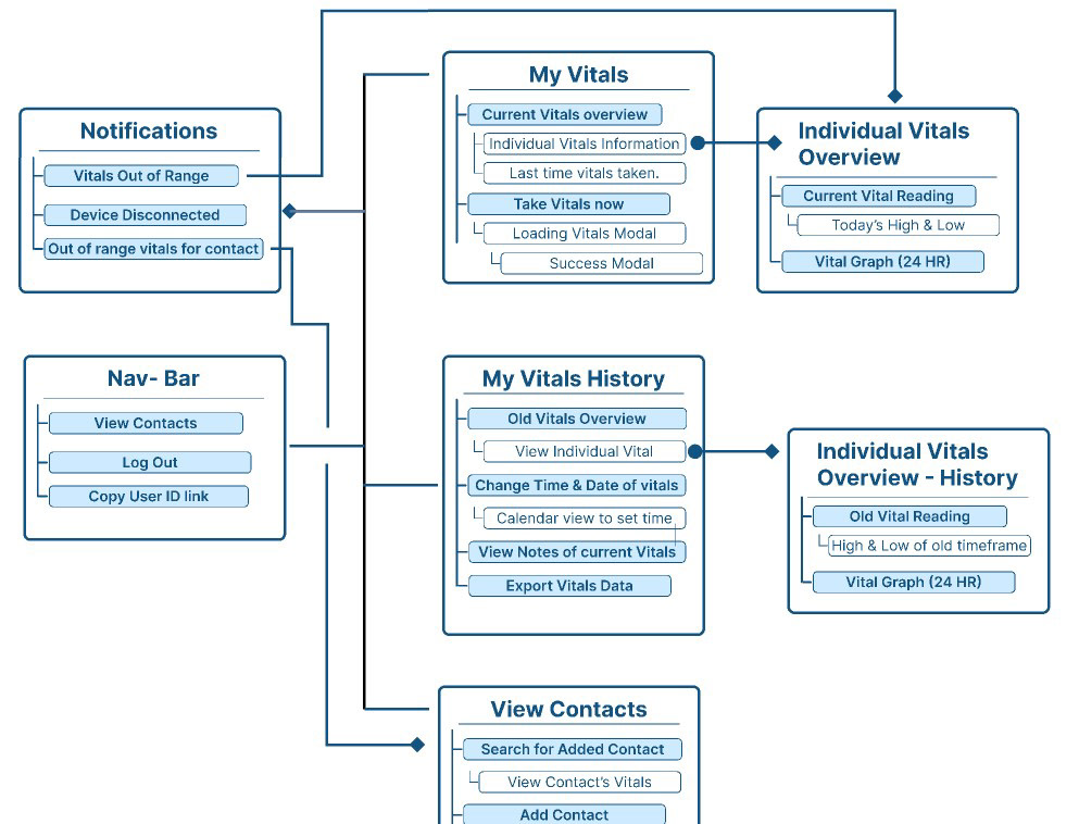
The initial prototypes suffered from a lack of organization, unclear hierarchy, and ineffective cross-linking between actions.
We recognized the importance of starting the process with a deep understanding of the app's existing architecture. The previous designer and I collaborated on creating an information architecture flow map to identify areas for improvement and determine how the app could better serve its users. We were able to identify key areas where the app could be enhanced and improved to create a more intuitive and user-friendly experience.
The information architecture of the Salyx app evolved from medical professionals to encompass both doctors and everyday users.
This transition was prompted by a directive to make the app more accessible and valuable to a wider audience. Through the construction of a wireframe and quick reassessment of key touchpoints, we successfully created a cohesive and inclusive information architecture. This journey enabled us to deliver a user-centric app experience that meets the needs of both medical professionals and users.
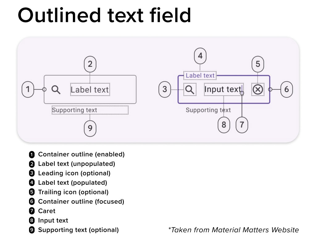
Applying best practices using Material Design
When it comes designing, the Google Material Design style components offer a set of guidelines and standards that have been thoroughly tested and refined to ensure that they provide the best possible user experience.
We were inspired by most of the patterns from Material Design. An example of this is our text inputs. We implemented the "outlined text field" pattern from Material Design as one of the many patterns that we based the new design on.
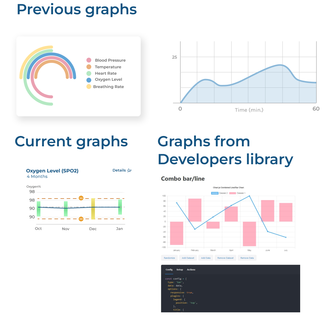
Harnessing Developer Feedback for Optimal App Design
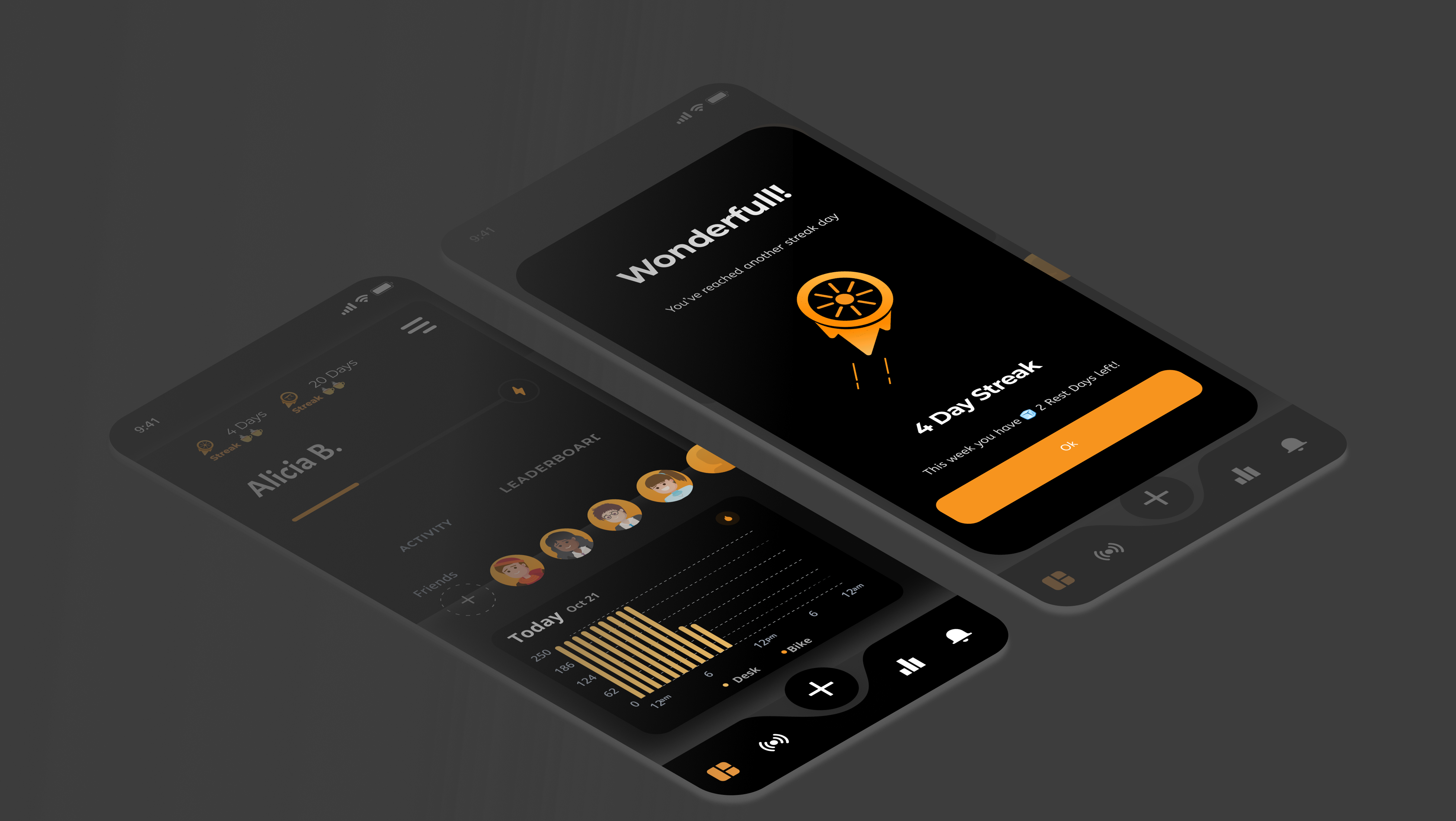
Through collaborative work with the developers, we tackled the challenge of designing a graph that effectively conveyed information while being feasible for backend development. By iteratively refining the design, we achieved a visually appealing and technically implementable graph that enhances the functionality of the app.
Overall, the Salyx project has provided me with valuable insights into the collaborative design process, the significance of accessibility features, and the importance of effectively communicating design choices to stakeholders. It has further strengthened my belief in the value of research-driven design and the role it plays in creating user-centered and impactful digital experiences.
The Web app
.